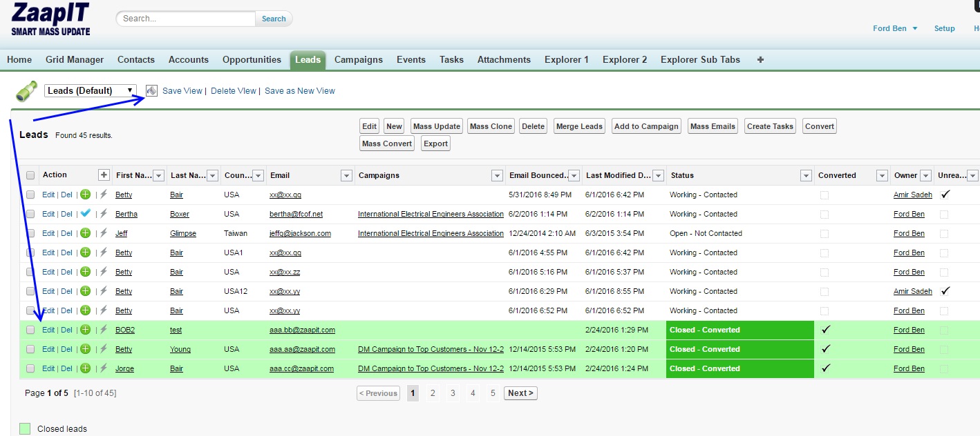
Add custom colors, images & style to your Salesforce’s grids and lists with ease with Smart-Mass-Update / Smart-Tables for Salesforce. Just follow the steps in the video and add your custom conditional design to your grids.
In today’s fast-paced business environment, visual clarity and personalized data representation are crucial for effective decision-making. Salesforce users often find themselves managing extensive lists and grids, which can quickly become overwhelming without proper organization and styling. This is where Smart-Mass-Update and Smart-Tables for Salesforce come into play, offering an innovative solution to enhance your data visualization.
Why Use Conditional Styling in Salesforce?
- Improved Data Readability: Conditional styling allows you to apply custom colors, images, and styles to your Salesforce grids and lists. By highlighting key data points, you can quickly identify trends, outliers, and important information, making your data easier to interpret at a glance.
- Enhanced User Experience: A well-styled grid not only looks professional but also improves user experience. When your data is visually appealing and logically organized, it reduces the time spent searching for information and increases productivity.
- Personalized Data Representation: Every business has unique needs and priorities. With conditional styling, you can tailor the appearance of your Salesforce data to reflect your specific business requirements. This customization ensures that the most relevant data stands out, helping you make more informed decisions.
- Consistency Across Teams: Implementing a standardized styling protocol ensures that all team members view data consistently. This uniformity minimizes miscommunication and ensures everyone is on the same page, facilitating better collaboration and efficiency.
Importance of Custom Conditional Design
Custom conditional design in Salesforce is not just about aesthetics; it’s about functionality and usability. Here’s why it’s important:
- Quick Insights and Actions: By using colors and icons to signify different statuses or categories, you can gain quick insights into your data. For example, you can use green to indicate completed tasks and red for overdue items. This visual cue allows for faster decision-making and prioritization.
- Reduced Errors: Clear visual distinctions help reduce errors. When data points are color-coded or highlighted based on specific conditions, it’s easier to spot discrepancies or issues that need attention. This proactive approach to data management can save time and resources in the long run.
- Scalability: As your business grows, so does the volume of data. Conditional styling helps manage this growth by maintaining clarity and organization within your Salesforce environment. It ensures that even with large datasets, you can maintain a clear and actionable view of your information.
Conditional Styling in Action:
The following image video will show you how to color new rows in green and how to add the the rule as a legend on the grid’s bottom.


